
Somerton, Somerset, TA11, United Kingdom
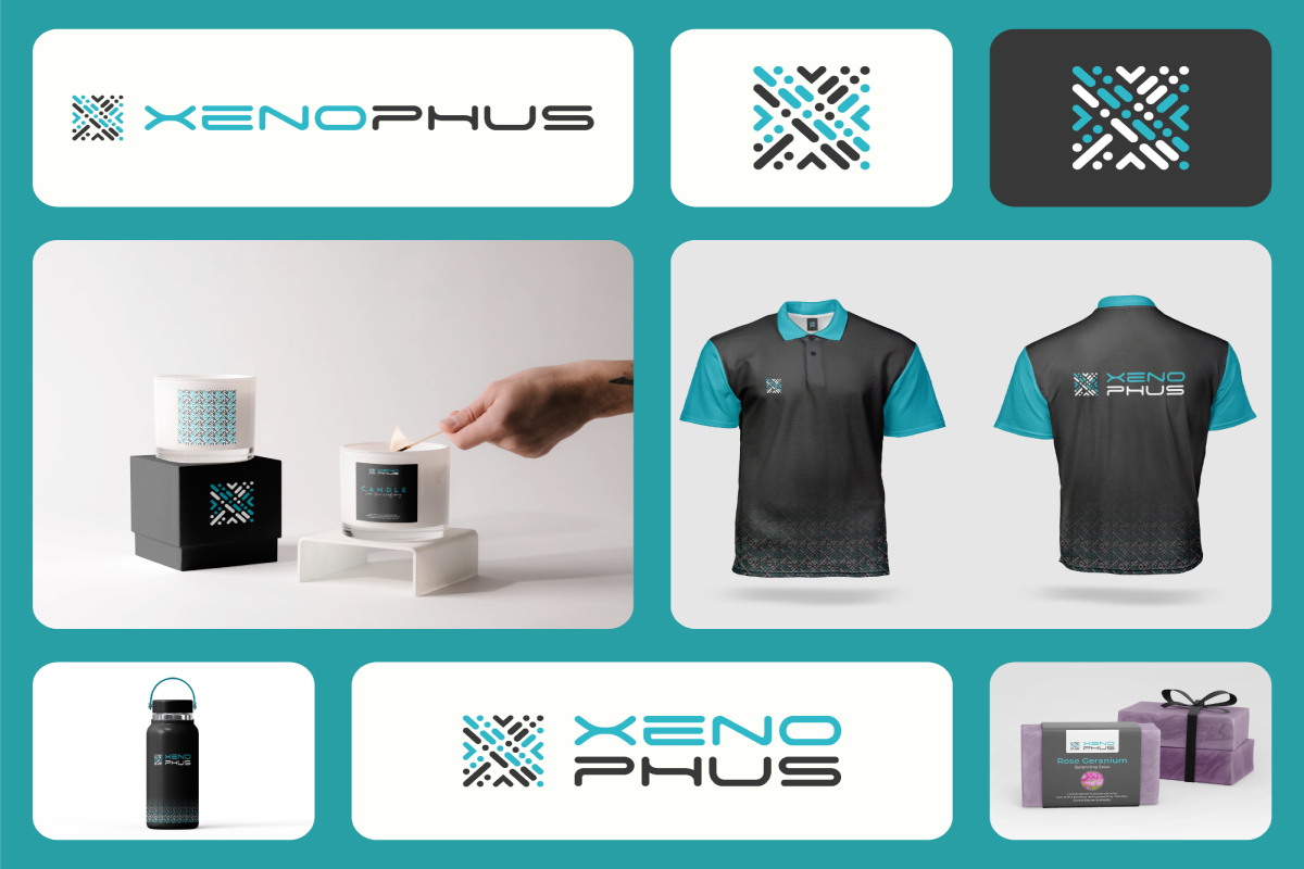
Xenophus approached us with a clear ambition: to build a brand identity that feels bold, modern, and strategically intelligent. The goal was not just to design a logo, but to create a visual system that reflects innovation, structure, and forward-thinking leadership.
We developed a distinctive identity that combines precision with personality. From logo structure and typography to color hierarchy and visual balance, every element was carefully crafted to communicate strength, clarity, and technological sophistication. The result is a cohesive brand presence that works seamlessly across digital platforms, presentations, marketing materials, and future expansions.
Xenophus now carries a visual identity that is confident, scalable, and built for long-term brand growth.
Creating the Xenophus identity required navigating several key challenges:
Balancing innovation with simplicity became the core design challenge of the project.
We approached Xenophus with a strategy-first mindset.
The logo was designed using structured geometry to reflect precision and reliability, while subtle modern elements introduced personality and forward momentum. A refined color system was developed to communicate trust, innovation, and authority. Typography selection focused on clarity and strength, ensuring consistency across all brand touchpoints.
XENOPHUS
Digital Agency
Lee Robertson
25 April ,2023
15 Days
Our team will answer all your questions. we ensure a quick response.
Beauty in a Bar was created to redefine natural skincare through purity, simplicity, and conscious luxury. The brand’s vision was clear, to offer all-natural beauty products that nourish the skin while staying rooted in ethical sourcing and sustainability.
Our objective was to craft a visual identity that communicates organic purity without losing a premium, spa-like feel. The brand needed to appeal to eco-conscious individuals who value wellness, self-care, and authenticity. From logo structure to color harmony and typography selection, every element was designed to reflect calmness, balance, and refined elegance.
The result is a cohesive brand identity that feels serene, trustworthy, and sophisticated, transforming skincare into a mindful ritual rather than just a routine.
Designing the Beauty in a Bar identity came with several key considerations:
Balancing elegance with authenticity became the central design challenge of the project.
We developed a refined identity centered around symbolism and subtle storytelling.
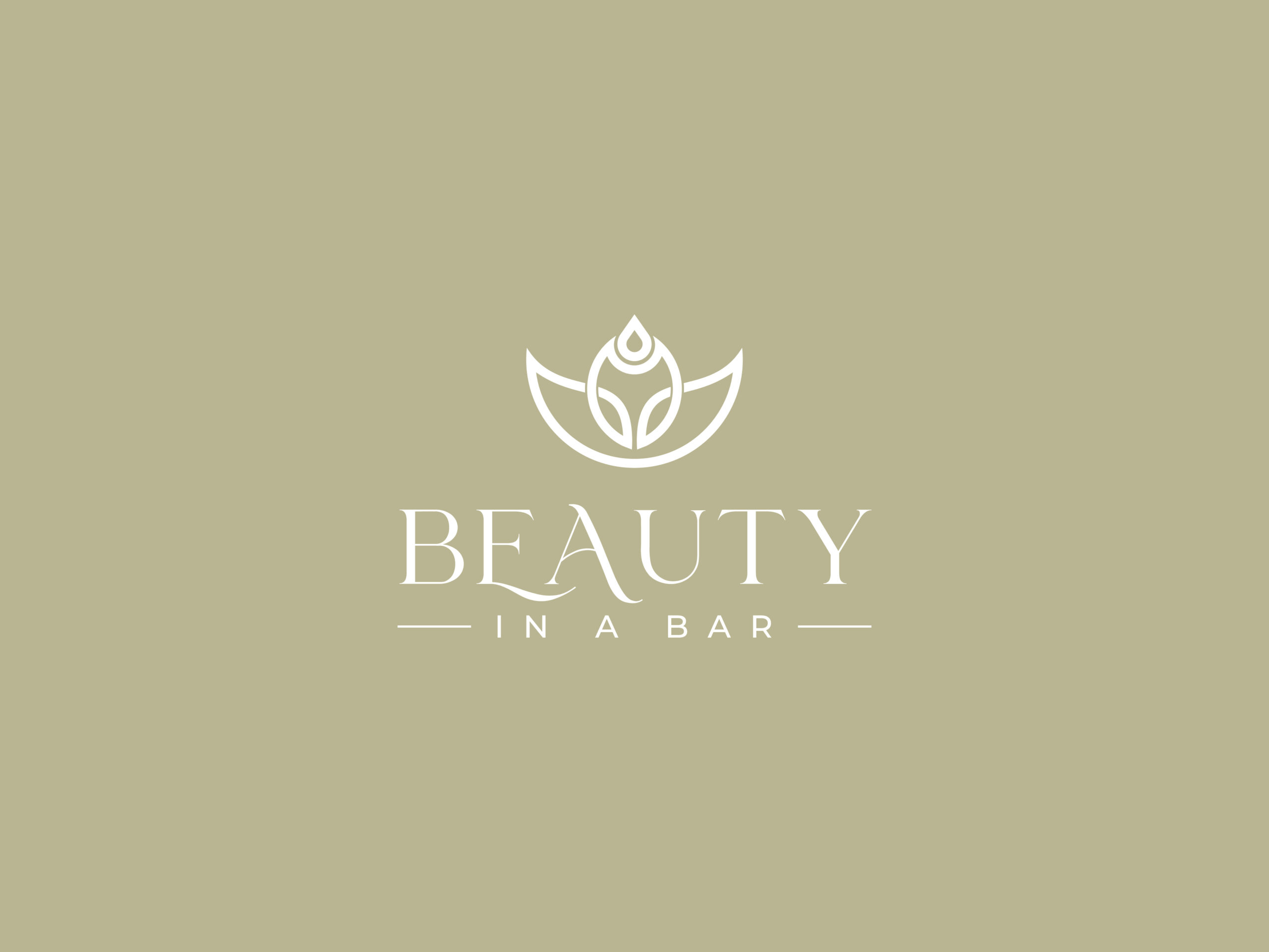
The logo integrates three powerful elements, a lotus flower, a water drop, and a unisex head profile. The lotus represents purity and growth, the water drop conveys hydration and renewal, and the abstract head silhouette symbolizes inclusivity and self-care for all. The combination creates a distinctive mark that feels organic yet premium.
A soft, nature-inspired color palette reinforces the brand’s commitment to sustainability, while the typography balances sophistication with approachability. The overall visual language is minimal, breathable, and spa-like, allowing the products to feel calm, clean, and trustworthy.
The final identity positions Beauty in a Bar as a modern, eco-luxury skincare brand that celebrates natural beauty with integrity and intention.
Beauty in A Bar
Health and Beauty
Becky Robertson
10 Jan,2024
15 Days
Our team will answer all your questions. we ensure a quick response.
Our brand identity process starts with understanding your vision, audience, and goals. We translate strategy into refined visual concepts, then build a cohesive identity system, including logo, colors, typography, and guidelines, designed to stay consistent and scalable across every platform.
01
We understand your brand vision, goals, and target audience through research and strategic consultation. This builds the foundation for a focused and meaningful identity.

02
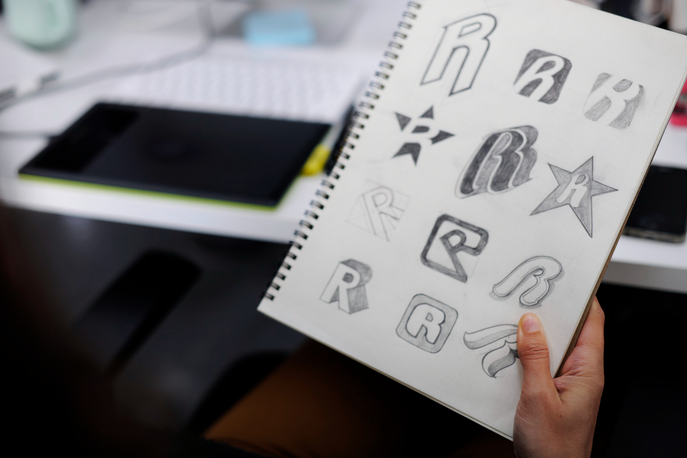
We explore creative directions, develop logo concepts, and define visual elements that reflect your brand personality and positioning.
03
We refine and finalize the identity system, including logo variations, color palette, typography, and brand guidelines, ready for real-world use.

Our brand identity package includes logo design, color palette, typography selection, brand guidelines, and logo variations. We create a complete visual system that ensures consistency across all platforms.
Typically, a full brand identity project takes 2–4 weeks depending on scope and feedback cycles. Timelines are discussed clearly during the discovery phase.
We present carefully developed logo concepts based on strategy and research. Each concept is thoughtfully crafted, not randomly generated, to align with your brand vision.
Yes. Upon final approval, you’ll receive high-resolution files including AI, EPS, PNG, SVG, and PDF formats, along with a brand guideline document for proper usage.
Absolutely. Beyond brand identity, we offer packaging design, social media branding, pitch decks, and website UI design to ensure a cohesive brand presence everywhere.
Our team will answer all your questions. we ensure a quick response.
Strategic Vision. Powerful Identity. Measurable Impact.
owner@xenophus.co.uk
Copyright © 2026 All Rights Reserved.
